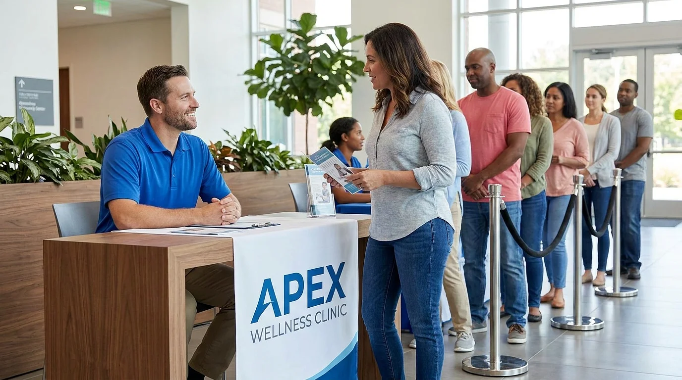
You do the offline work, and you do it well. The lunch-and-learn at the gym. The networking group every other Thursday. The free workshop that packed the room. The physician who says nice things about you in the hallway. And still, the number of those warm introductions that actually turn into booked patients is all over the map. Some weeks it clicks. Some weeks it goes quiet, and you cannot quite figure out why.
Here is the thing most practice owners miss: there is a silent step between a great conversation and a booked appointment, and it does not happen in the room. It happens later that night, on someone's phone. That is exactly why physical therapists need a website, even the ones who swear they get every patient by referral. Let me show you what the research says about that moment, and how your site either finishes the job or quietly undoes it.
The hidden step between "nice to meet you" and a booked appointment
People do not act on a recommendation blindly. They validate first, and they do it online. In a 2024 survey on how patients choose providers, 92% said they read a provider's bio before booking, up from 76% in 2018. Another 77% said they look for photos or video before they commit.
Read that again. Even when someone is handed your name by a person they trust, most of them still go check you out before they call. The referral gets you considered. Your website gets you chosen.
So the real question is not whether your networking is working. It is what happens in the ten minutes after. When that warm lead types your clinic name into their phone, what do they find? If the answer is a confident, clear, current site that sounds like the person they just met, the momentum carries them straight to your booking page. If the answer is a thin one-pager from 2019, or nothing at all, the doubt creeps back in.
You get about 50 milliseconds to prove you belong
This is the part that surprises people. The judgment happens fast. Really fast.
Researchers have found that visitors form a first impression of a website in roughly 50 milliseconds. That is not a typo, and it is not enough time to read a single word. It is a gut reaction to how the page looks and feels.
And that gut reaction sticks. In the long-running Stanford Web Credibility research, 75% of people admitted they judge a company's credibility based on its website, and 46% based that judgment on visual design alone: layout, typography, whether it simply looks current. Designers call the follow-on effect the aesthetic-usability effect. When something looks well made, people assume it works well too. A clean site quietly tells them your care is just as buttoned-up.
For a cash-pay practice, that credibility gate sits even higher. Your patient is spending their own money, out of pocket, by choice. They are not only asking whether you are a good PT. They are asking whether you are worth it. Your website is where they answer that question, whether you want it to be or not. I broke down the fast version of this in the 3-second test most PT clinic websites quietly fail.
Why this matters more, not less, when you live on referrals
Here is the counterintuitive part, and it is the whole point.
The more your practice runs on word of mouth, networking, and free workshops, the more your website matters, not less. Every one of those channels ends in the same place: a search. The handshake, the talk, the physician note, the "you should really see them" from a friend. All of it funnels a real human to their phone, and their phone takes them to your site.
That means your website is not competing with your relationship-building. It is the multiplier on it. Great networking with a weak site is a bucket with a hole in the bottom. You keep pouring in warm leads, and a predictable slice of them leak out at the validation step. You never see it happen, because the person who hesitated never tells you they hesitated. They just do not book.
Owners who finally invest in the site tend to describe the same thing our clients do: the networking and the workshops suddenly seem to work better. Nothing changed about the room. What changed is that the follow-up search now confirms the impression instead of denting it. Results vary from practice to practice, but the pattern is remarkably consistent.
What people are actually checking when they look you up
When that warm lead lands on your site, they run a quick, mostly subconscious checklist. Give them clear answers and the visit ends on your booking page. Make them hunt, and the doubt wins. Here is what they are really looking for:
Who you are and who you help. The first screen should say, in plain language, what you do and who it is for. If they have to scroll just to learn whether you are even the right kind of PT for them, you have already lost momentum.
Proof that matches the hype. Reviews, real results, and credentials, placed right where decisions get made. This is where testimonials and Google reviews earn their keep. If patient privacy makes reviews tricky in your practice, here is how to collect them without asking patients to overshare.
An obvious next step. Booking should be one click away from anywhere on the site. A warm lead who is ready to go should never have to go looking for how.
Current, consistent information. In BrightLocal's consumer research, 85% of people said a business's contact info and hours matter, and 56% said they check that those details match across the web before acting. A dead phone number or a stale address reads as "maybe they are not around anymore."
None of this is fancy. It is simply the difference between a site that confirms you and a site that raises questions.
How to turn your website into your best closer
You do not need a full redesign to fix this. You need the site to finish the conversation your networking started. A few high-leverage moves:
Make the first screen echo your in-person pitch. Whatever you say when someone asks what you do, that exact promise should be the first thing on the page. No whiplash between the you they met and the you online.
Put booking one click from everywhere. Every page, top and bottom. The moment they decide, do not make them search for the door.
Give every workshop and talk its own landing page. When you speak, point the room to one simple page instead of your homepage. It keeps the specific promise you just made and captures people while the talk is still fresh.
Keep it obviously current. A recent article, the right year in the footer, updated hours. Small signals that say "we are here, and we are busy."
Show the proof where the decision happens. Put a review or a result right next to the booking button, not buried on a testimonials page nobody visits.
If you want the deeper build, we covered the mechanics in physical therapy website design that actually books patients, and the specific leaks to plug in the conversion killers hiding on most PT clinic websites.
The bottom line
Your reputation opens the door. Your website decides whether they walk through it. That is the quiet truth behind why physical therapists need a website even when the calendar is already full of referrals: the relationships get you considered, and the site closes the deal while you sleep.
So the next time you finish a workshop or shake a hand, assume they will look you up that night. Then go make sure the site they find finishes the job. If you want a second set of eyes on whether yours is helping or hurting, book a free strategy call and we will walk through it together.
References
Fogg, B.J., et al. "How Do Users Evaluate the Credibility of Web Sites? A Study with Over 2,500 Participants." Stanford Web Credibility Project, 2002. credibility.stanford.edu
Lindgaard, G., Fernandes, G., Dudek, C., & Brown, J. "Attention Web Designers: You Have 50 Milliseconds to Make a Good First Impression!" Behaviour & Information Technology, 25(2), 115-126, 2006. Journal listing
Aha Media Group. "How Patients Choose Doctors: 2024 Study" (534 respondents). ahamediagroup.com
Nielsen Norman Group. "The Aesthetic-Usability Effect." nngroup.com
BrightLocal. "Local Consumer Review Survey." brightlocal.com